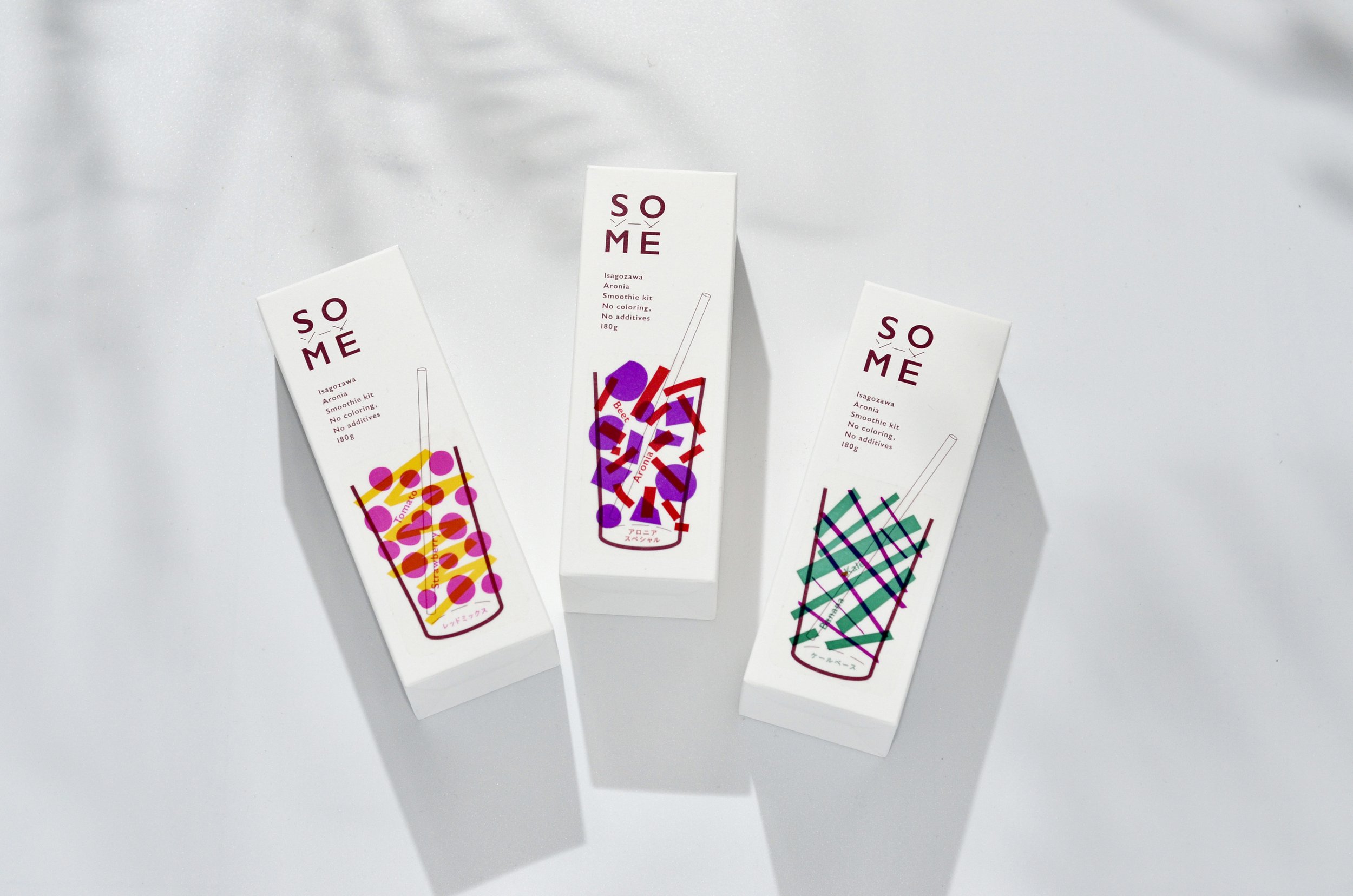
Dried vegetables brand OYAOYA

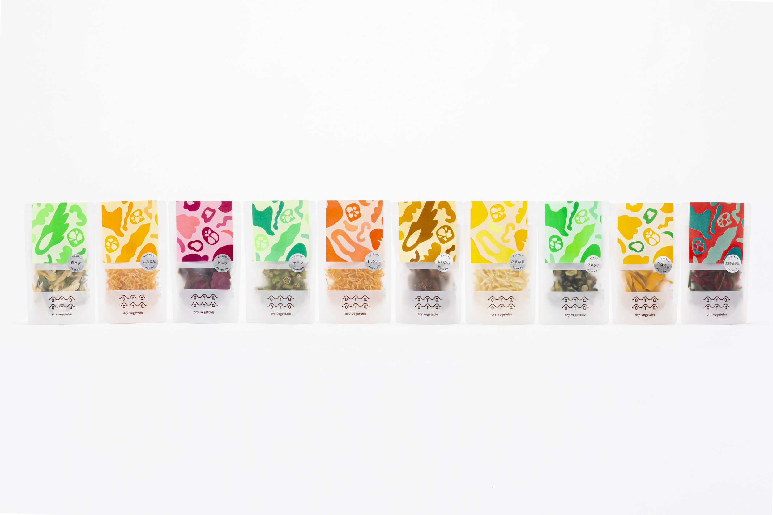
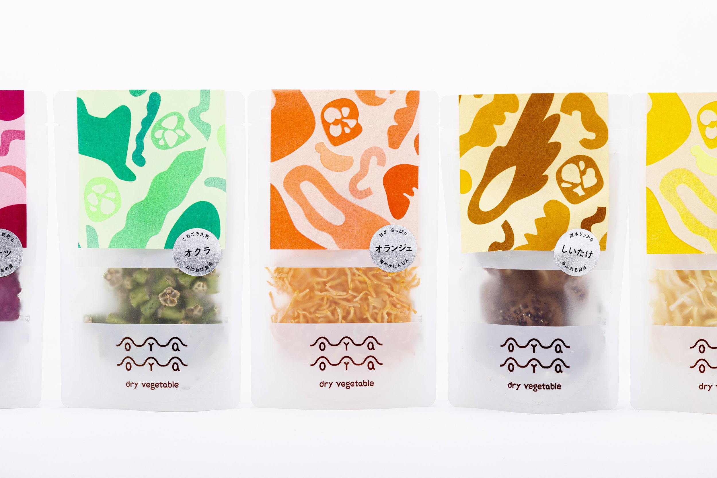
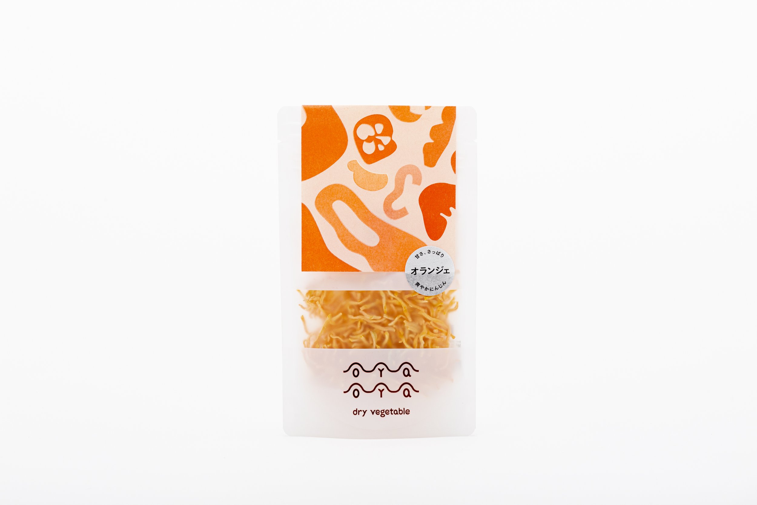

Dried vegetables brand OYAOYA
Client: OYAOYA
Design: Polar Design Inc.
Art Direction: Takashi Kuroyanagi
Design: Takashi Kuroyanagi, Ayano Yamaura,Mima Akira
Copy Writing: socko
Country: Japan
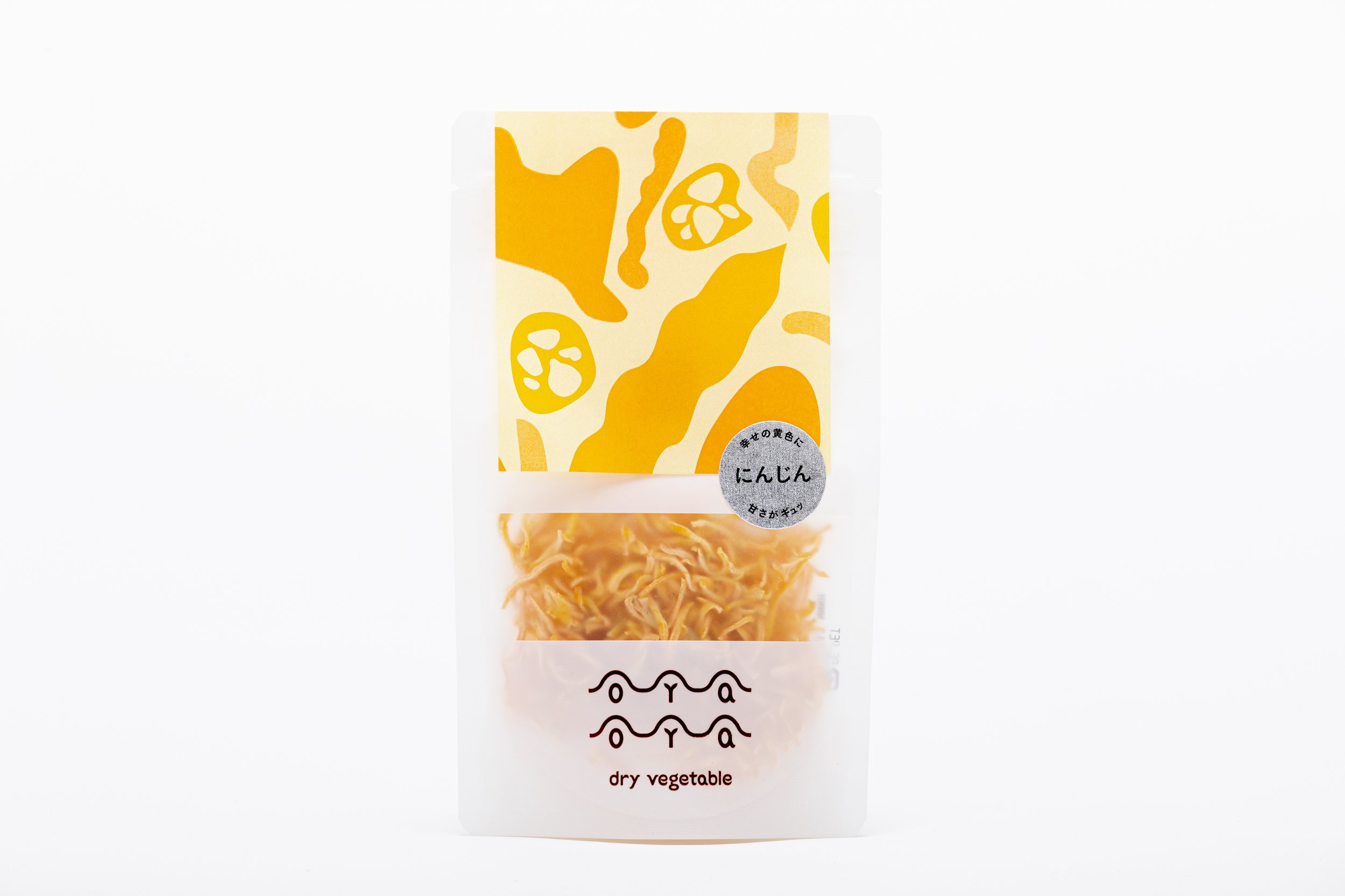
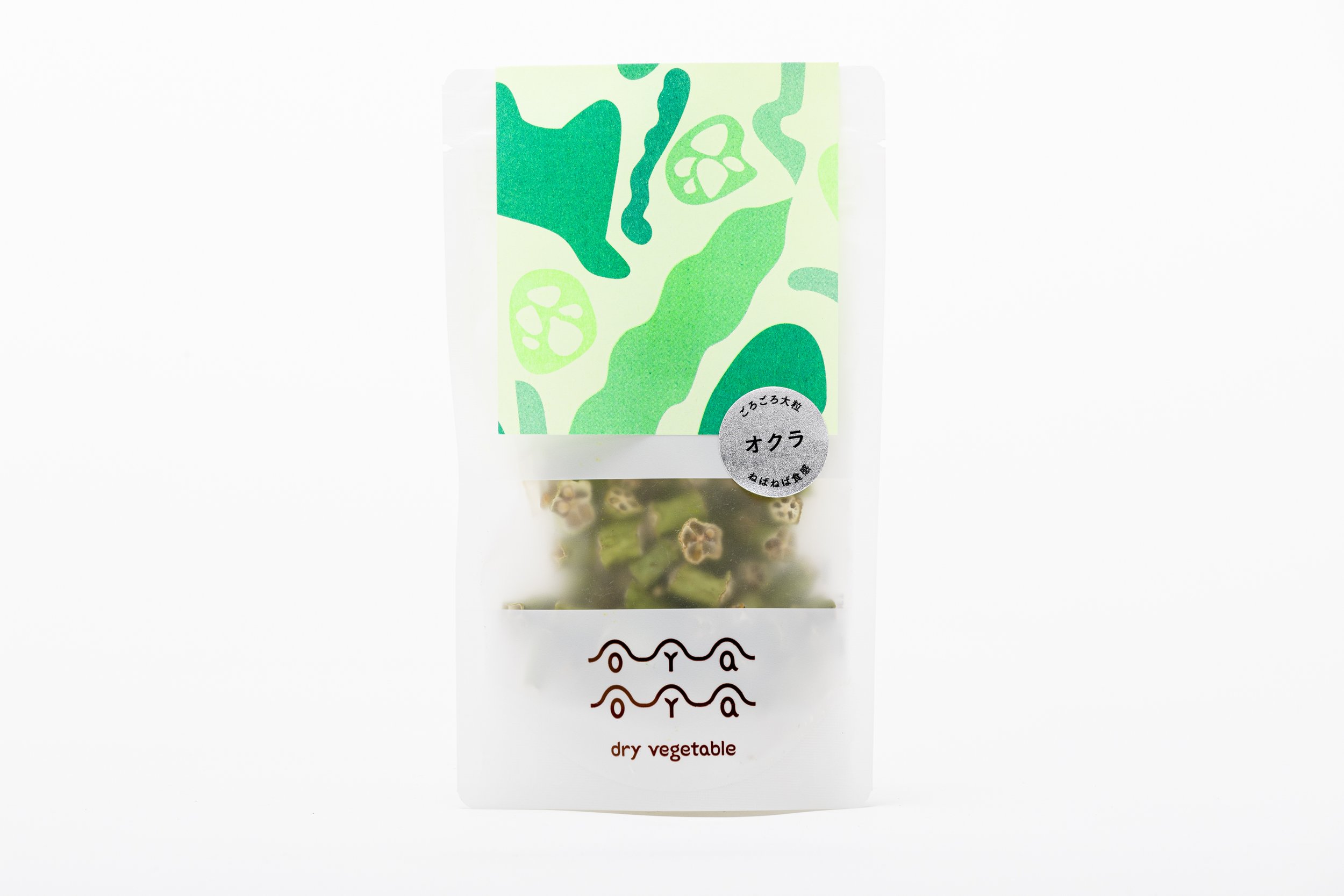
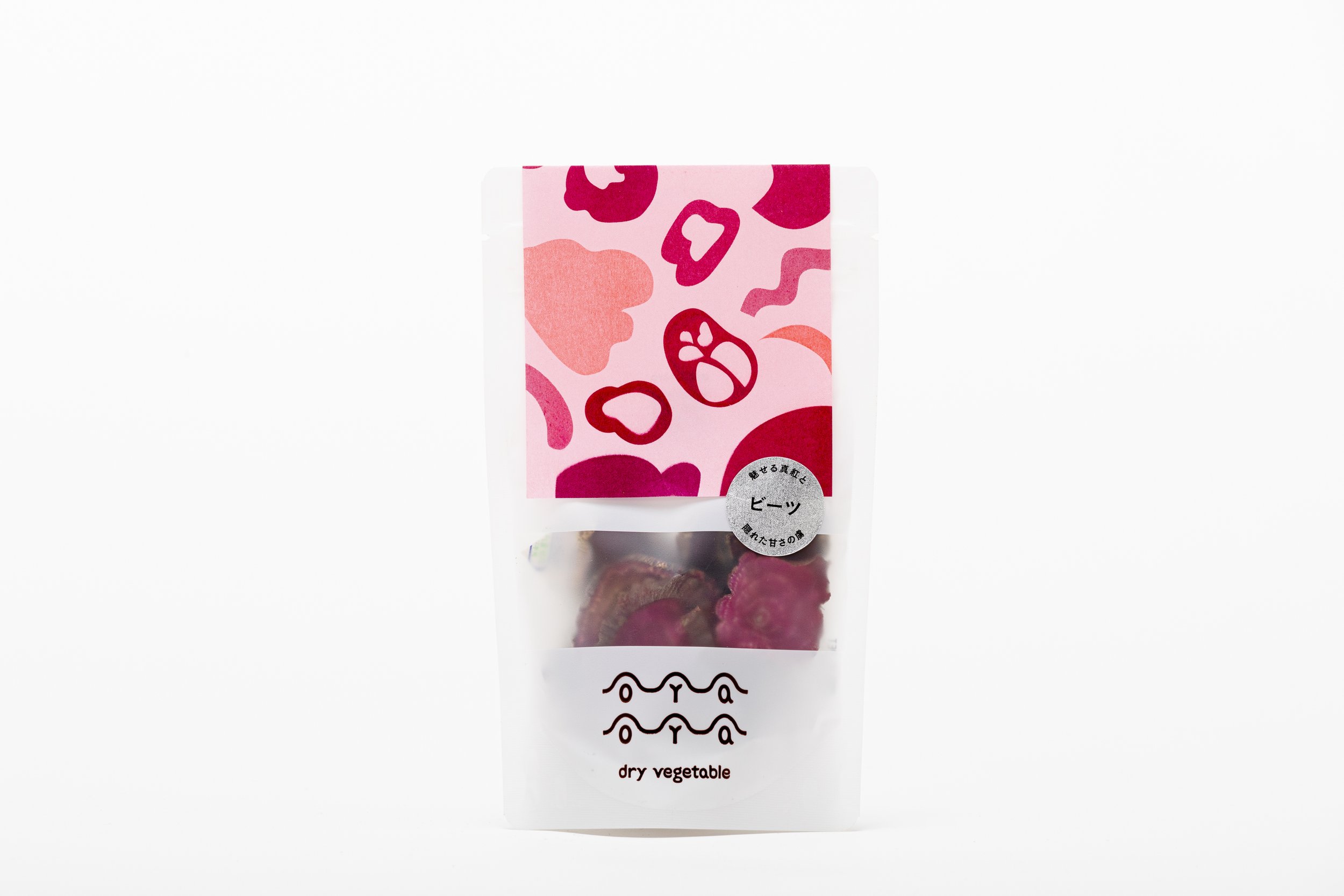
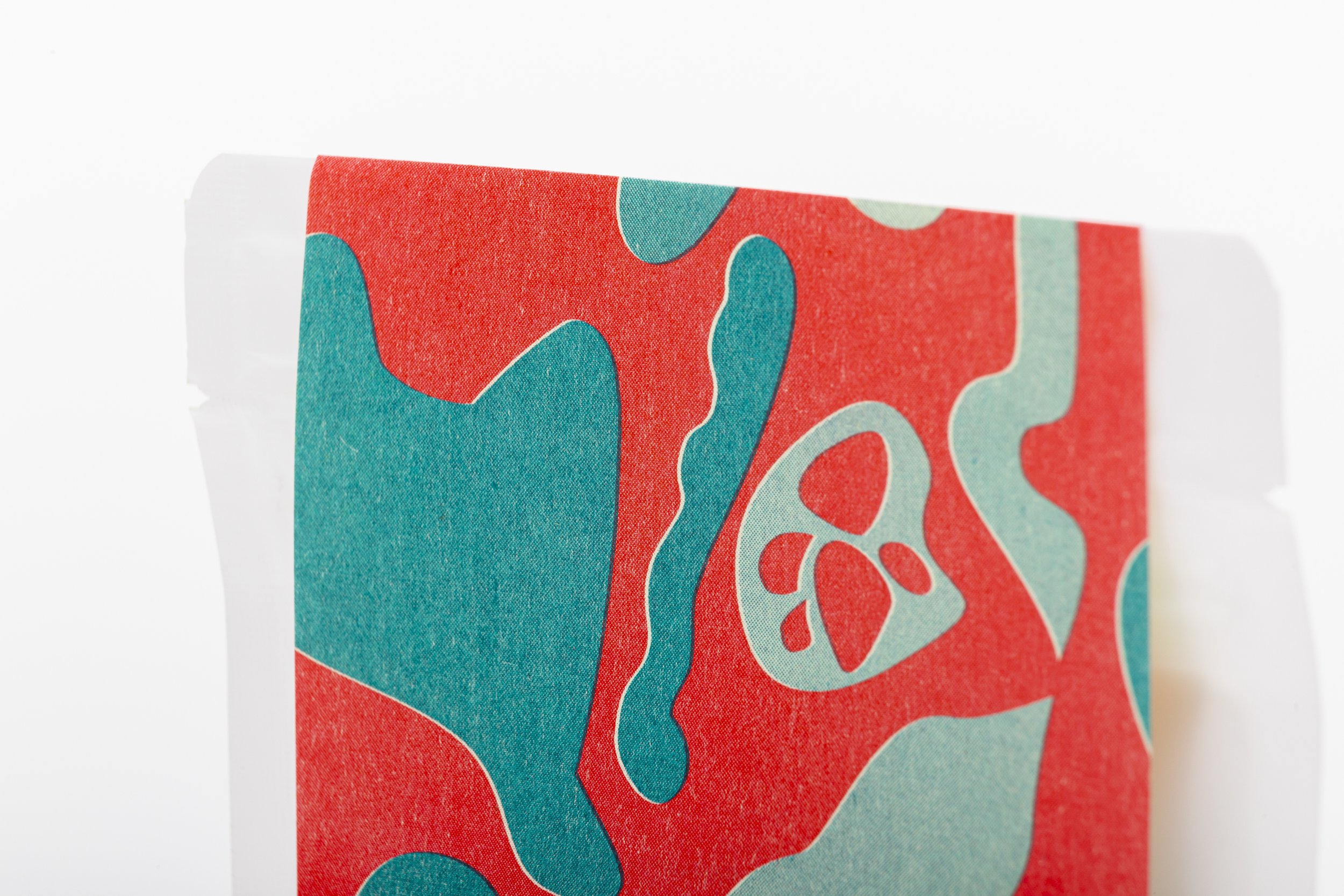
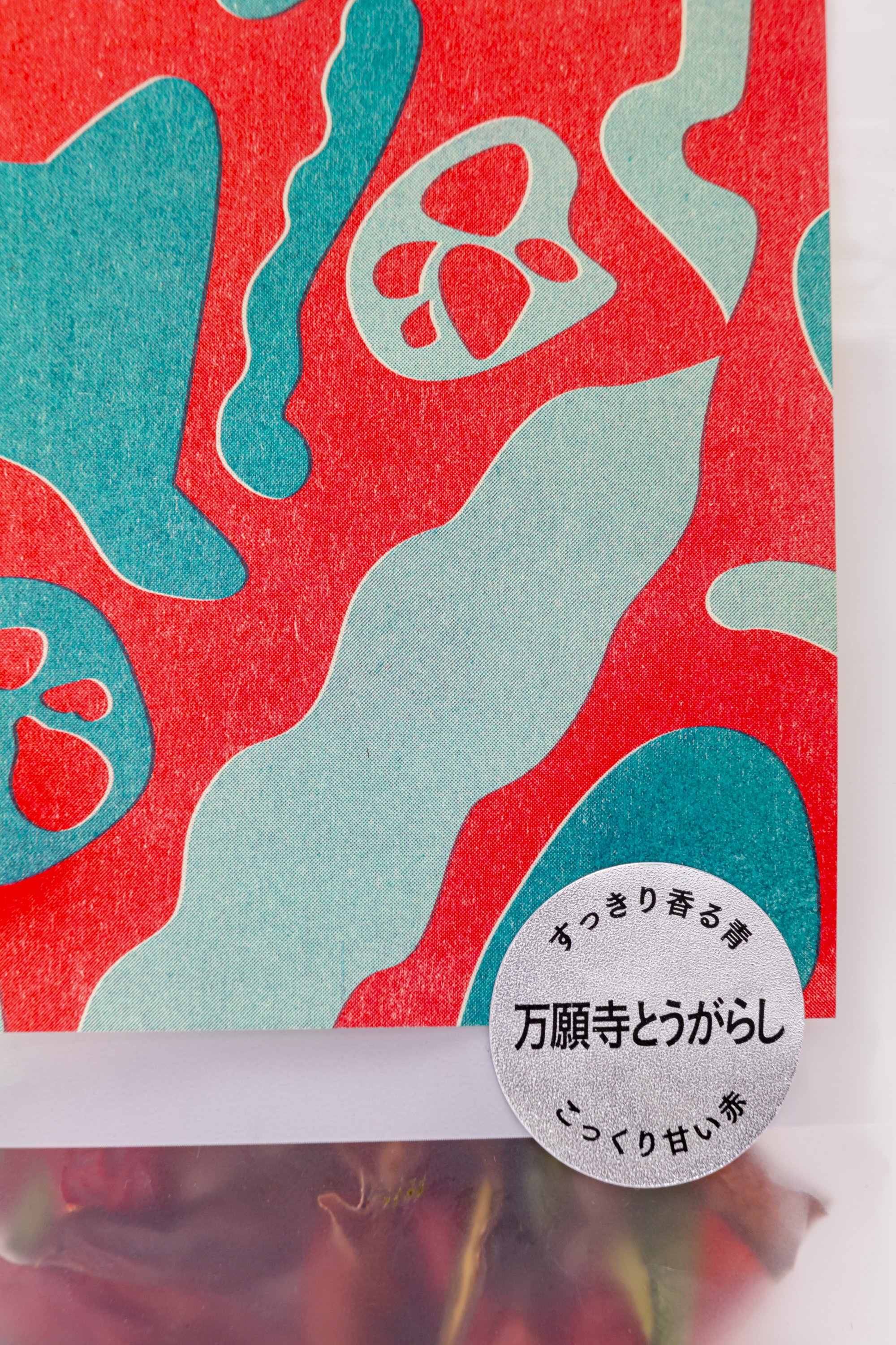
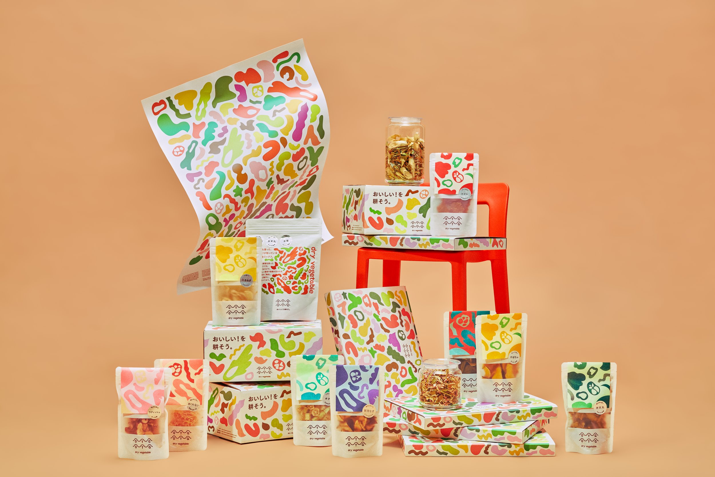
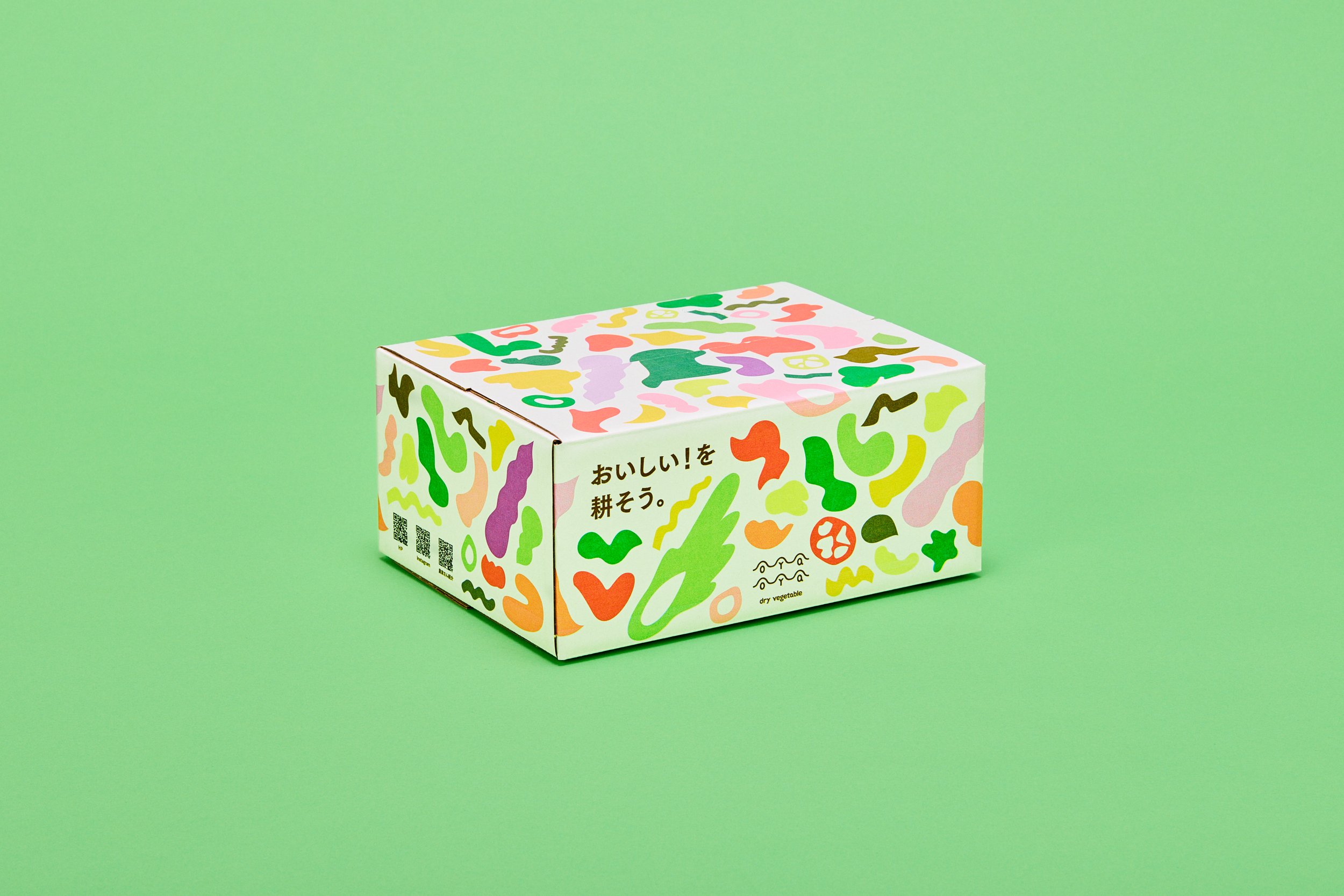
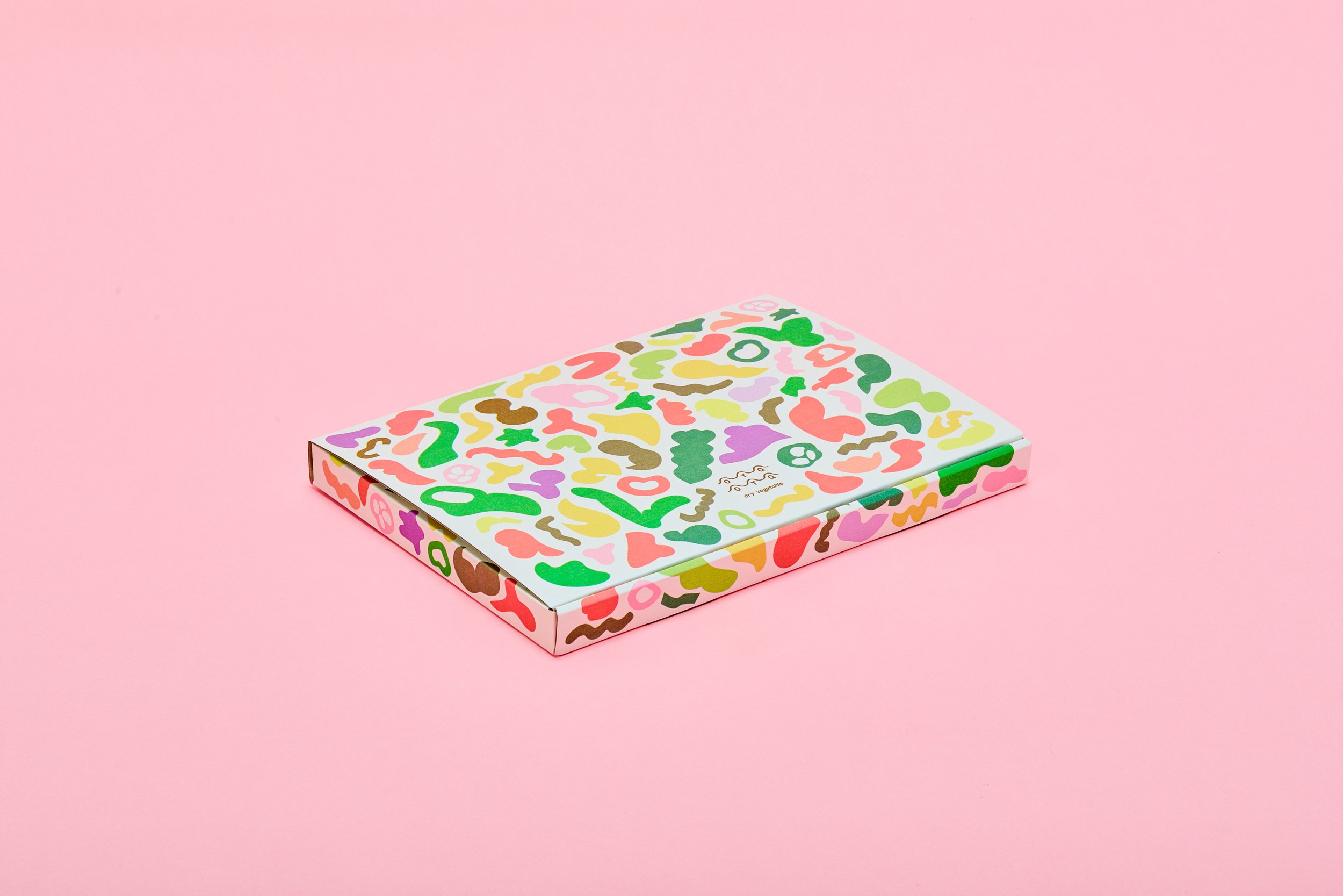
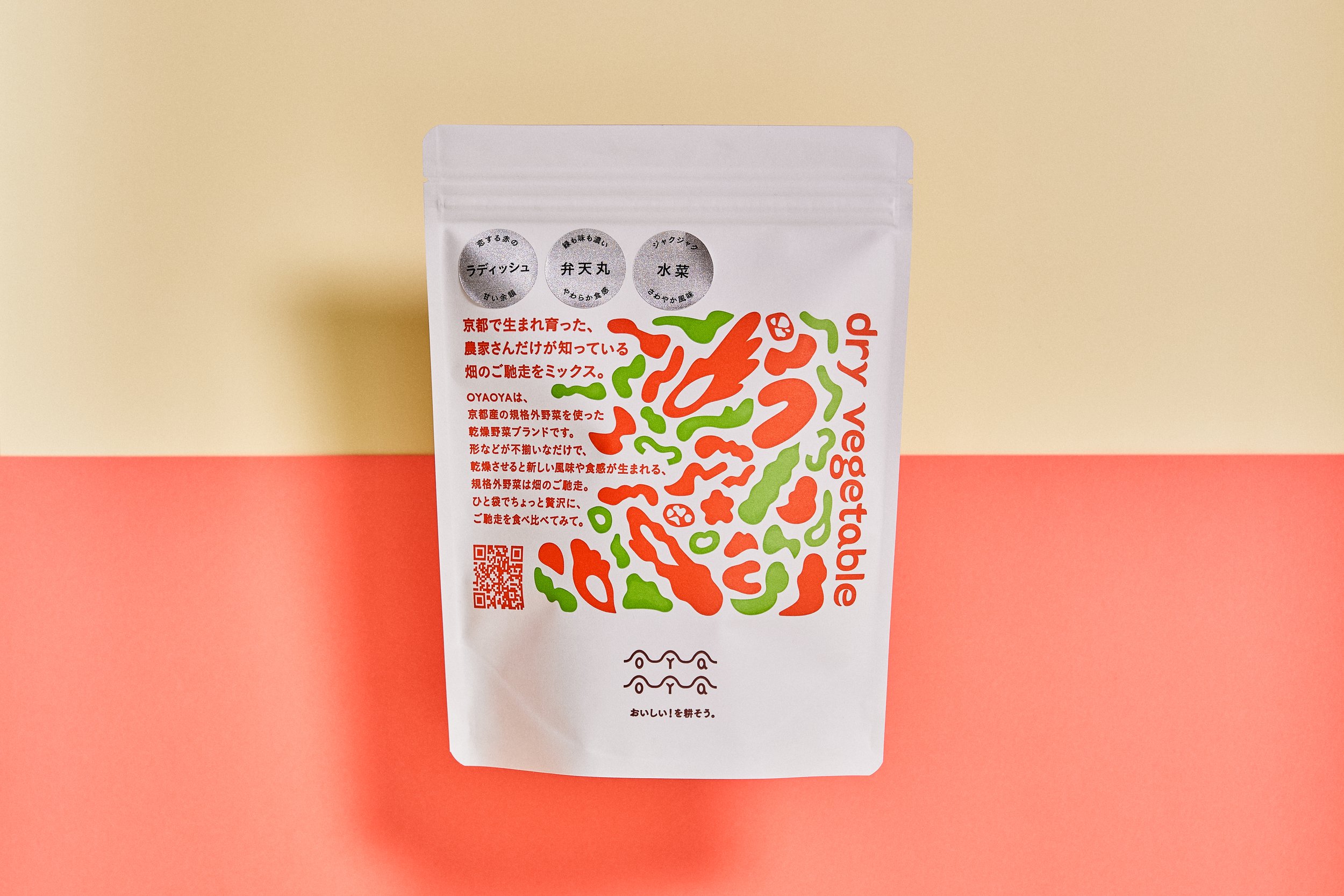
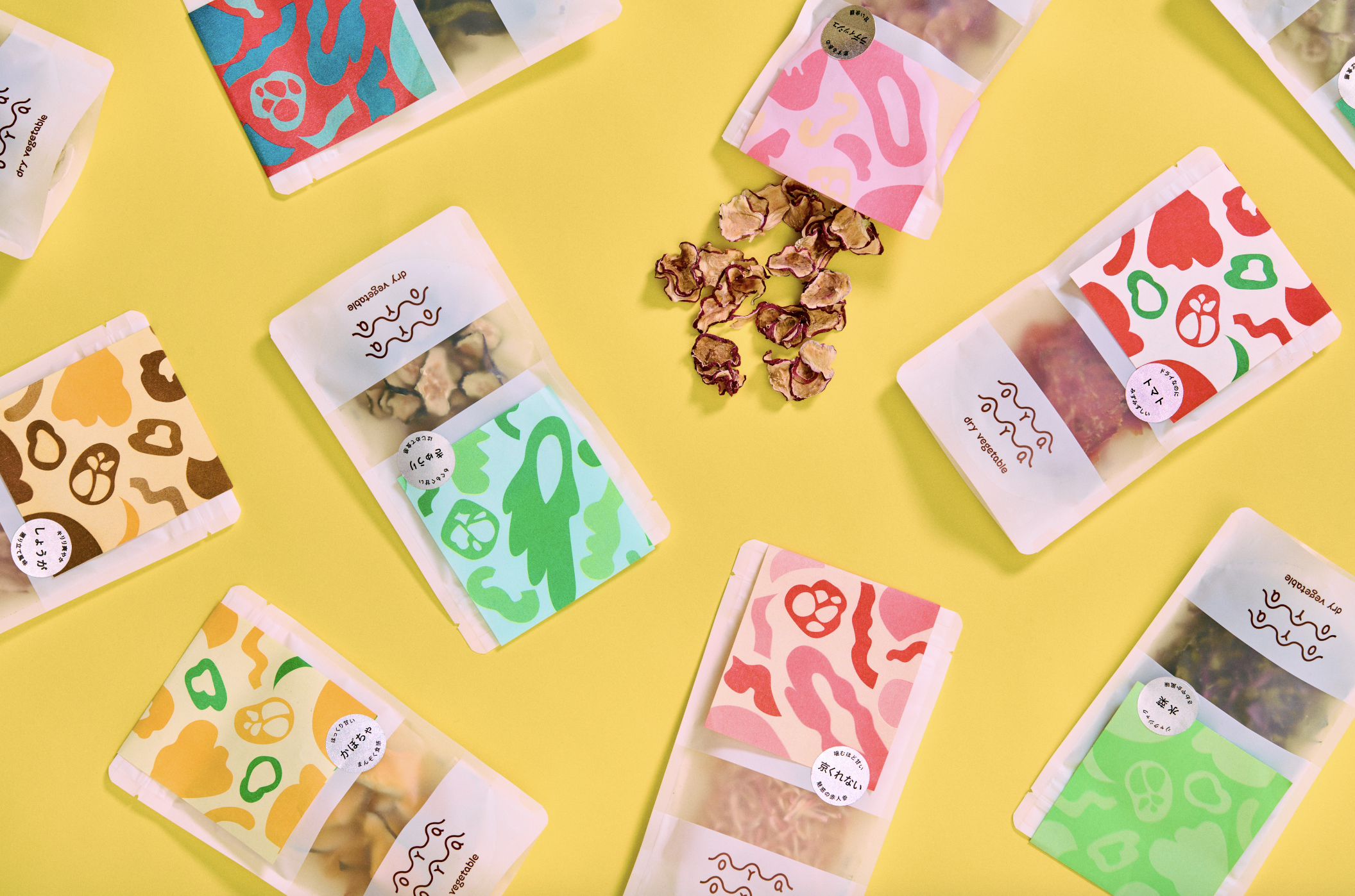
Creating new value by drying substandard vegetables that had been discarded or cheaply processed near Kyoto, and giving them vivid packaging that expresses their concentrated flavor and rich nutrition. The company is confronting the issues of food loss and the survival of local agriculture.
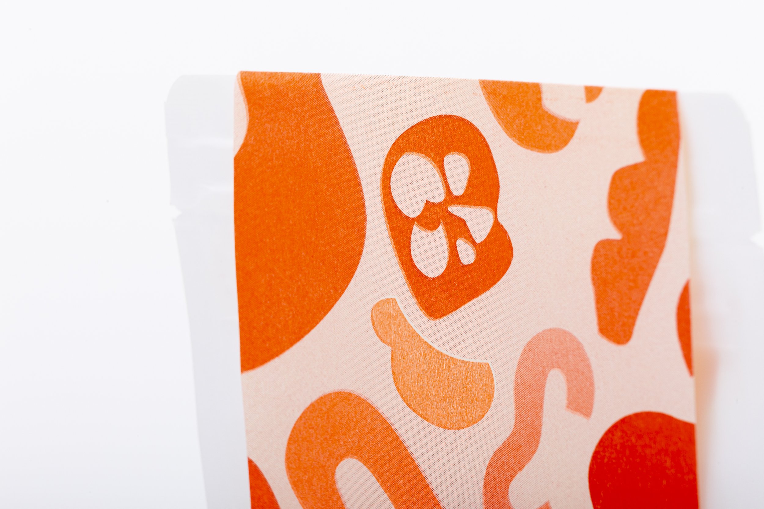
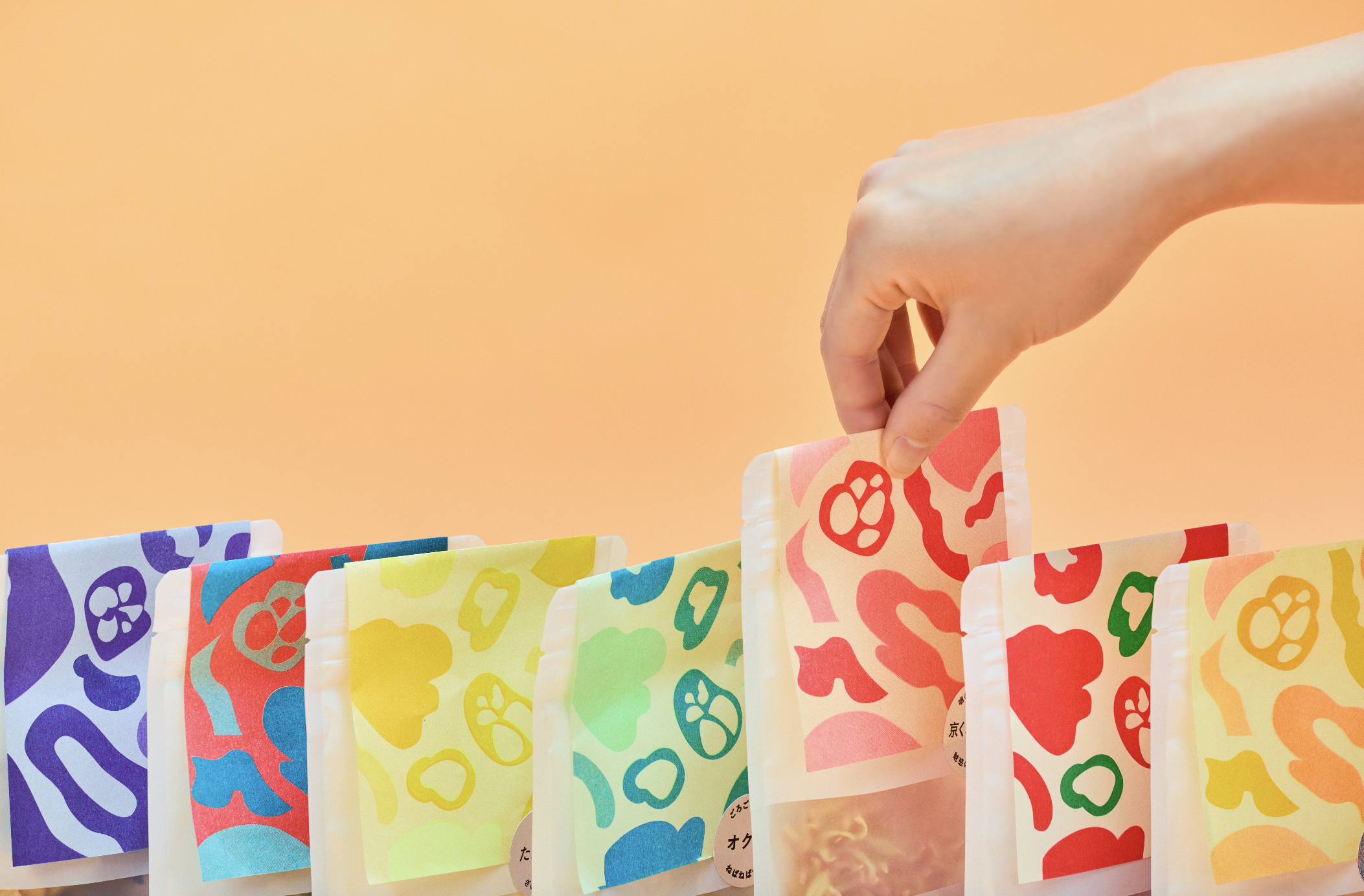
The brand logo represents seeds sprouting in ridges. The cover label, like the uneven vegetables, was designed with printing colors and layout so that a variety of color patterns would appear on each product.
TOPAWARDS ASIA


