COEDO

COEDO
Client: Kyodoshoji Corporation Limited COEDO BREWERY
Design Company: EIGHT BRANDING DESIGN Co., Ltd.
Branding Design: Akihiro Nishizawa
Design: Keisuke Kitahara
Country: Japan
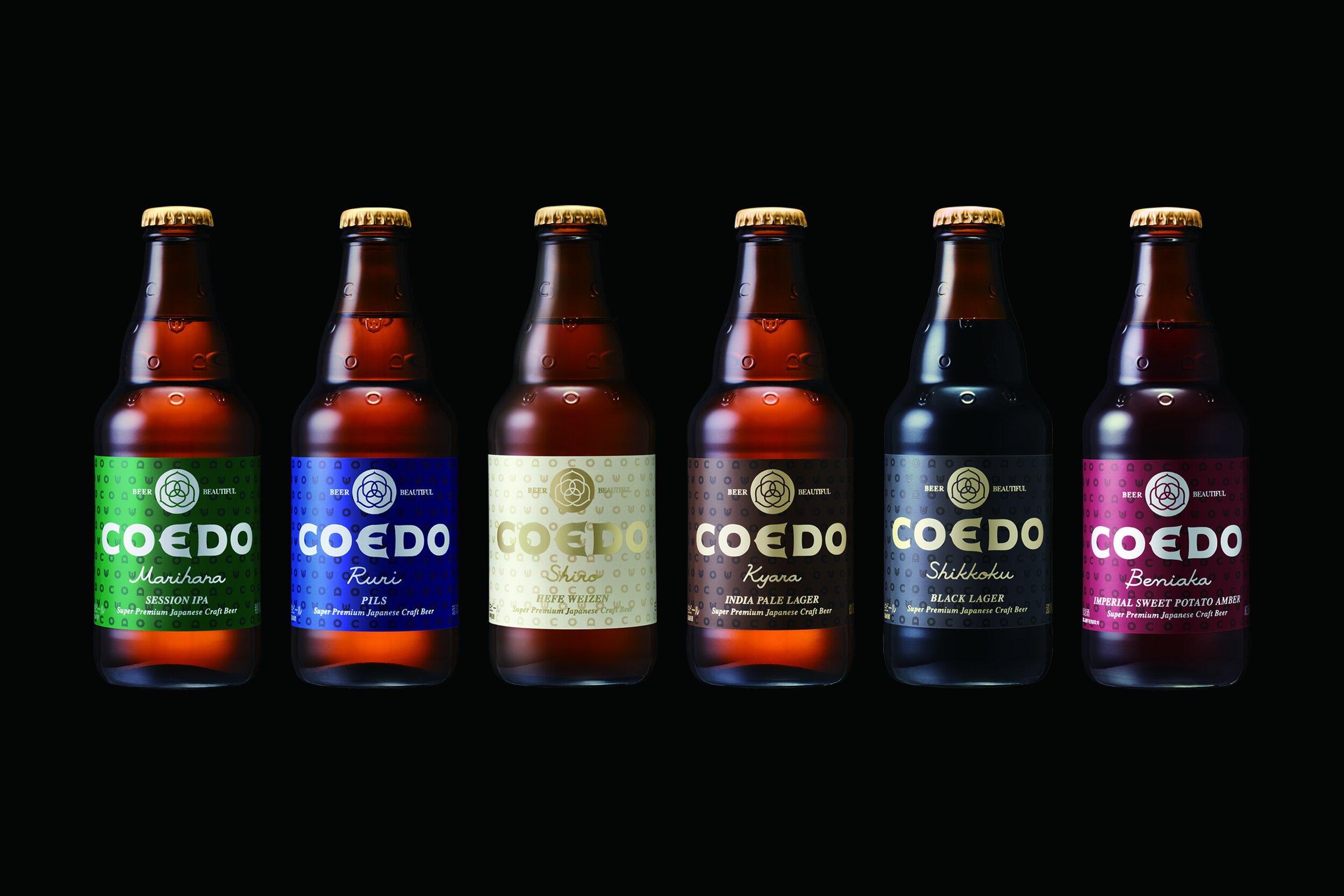
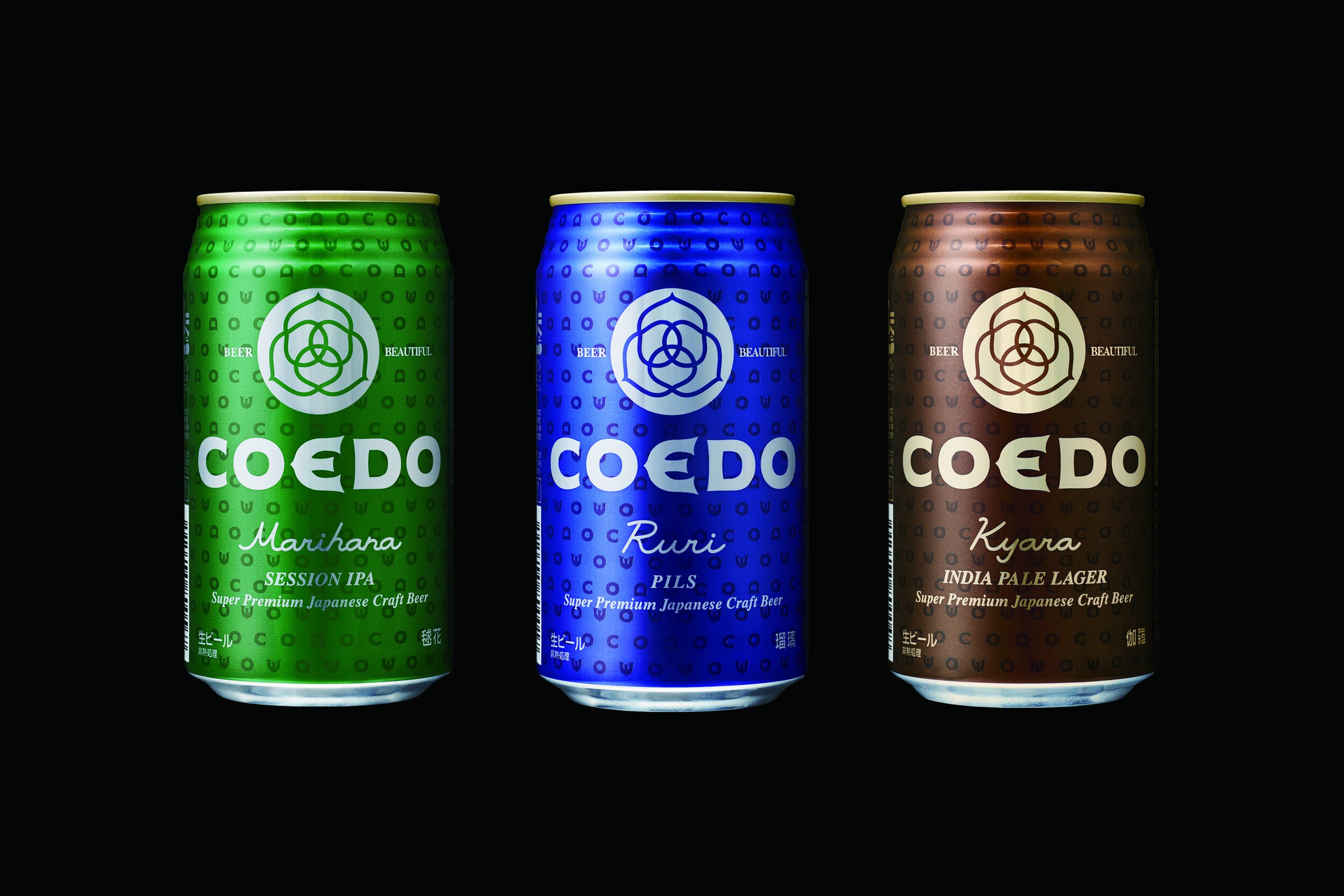
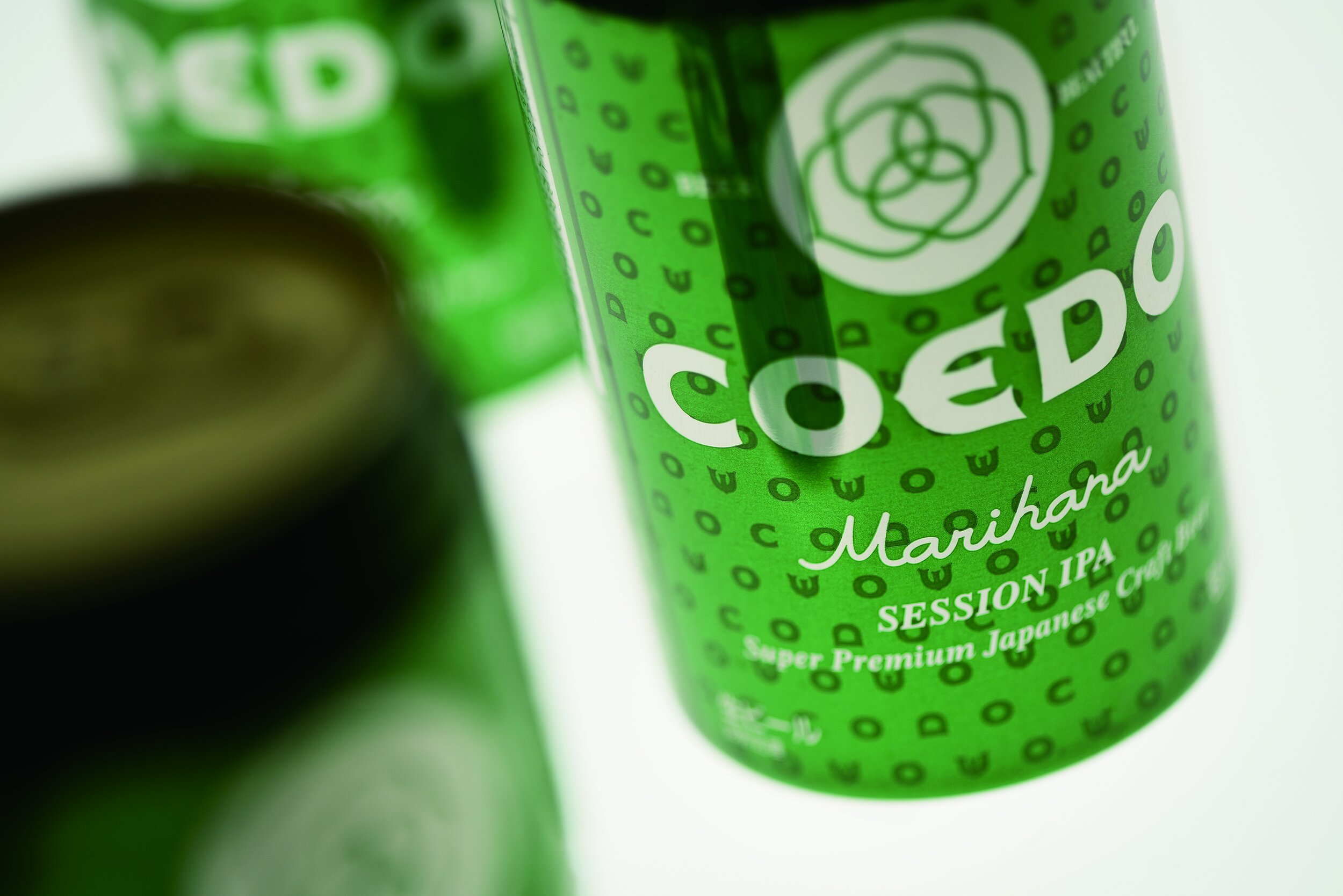
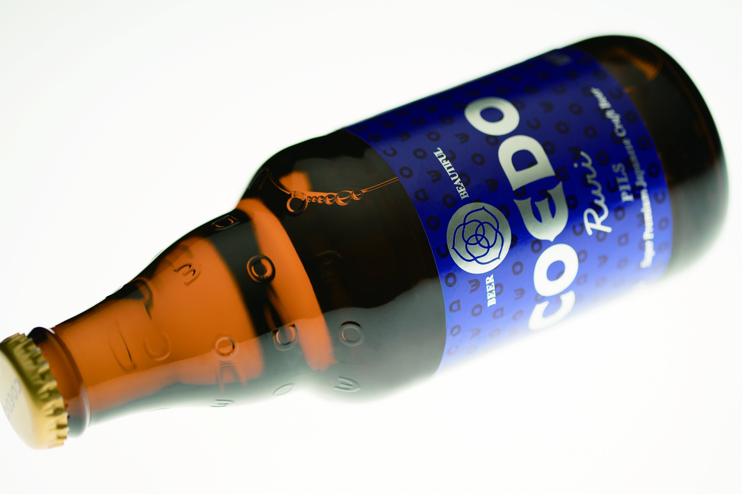
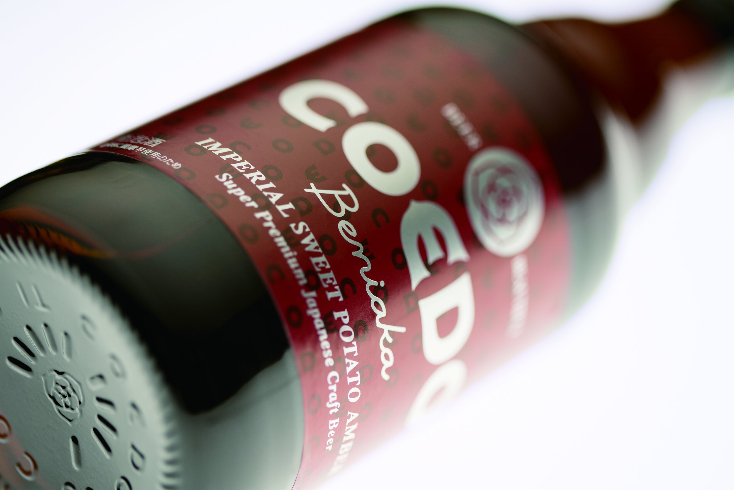
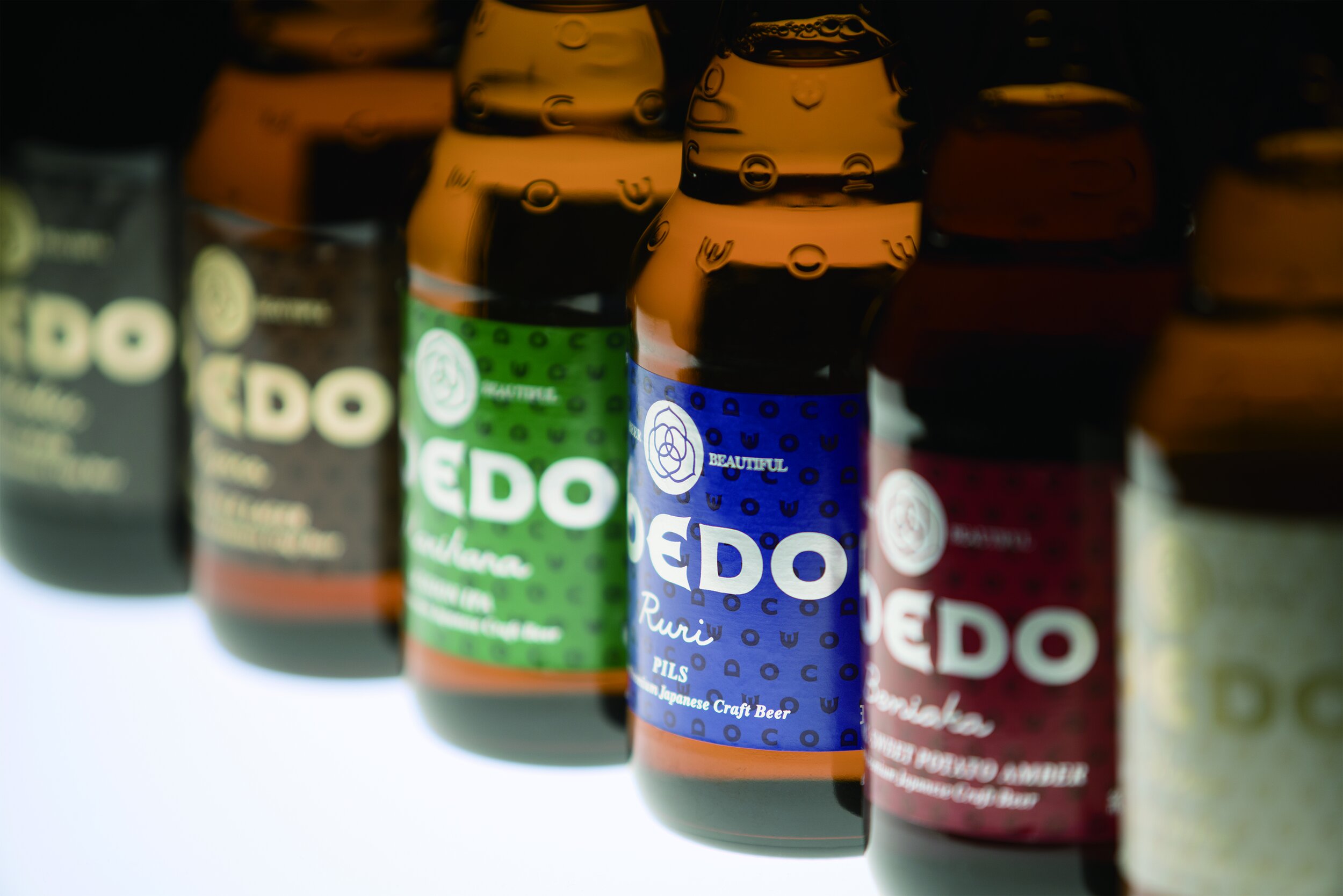
Based in Kawagoe City, Saitama Prefecture, “COEDO”, a premium craft beer brand that is also highly-regarded overseas, has developed 6 kinds of classic beers. It’s brand concept, “Beer Beautiful” brings the idea that “beer is inherently rich in color, taste, and flavor; fun and wonderful.” It’s logo is a design that abstracts the shape of hops (main ingredient of beer) from a bird’s eye view. Combined with the logotype, the aesthetic gives a sense of prestige.
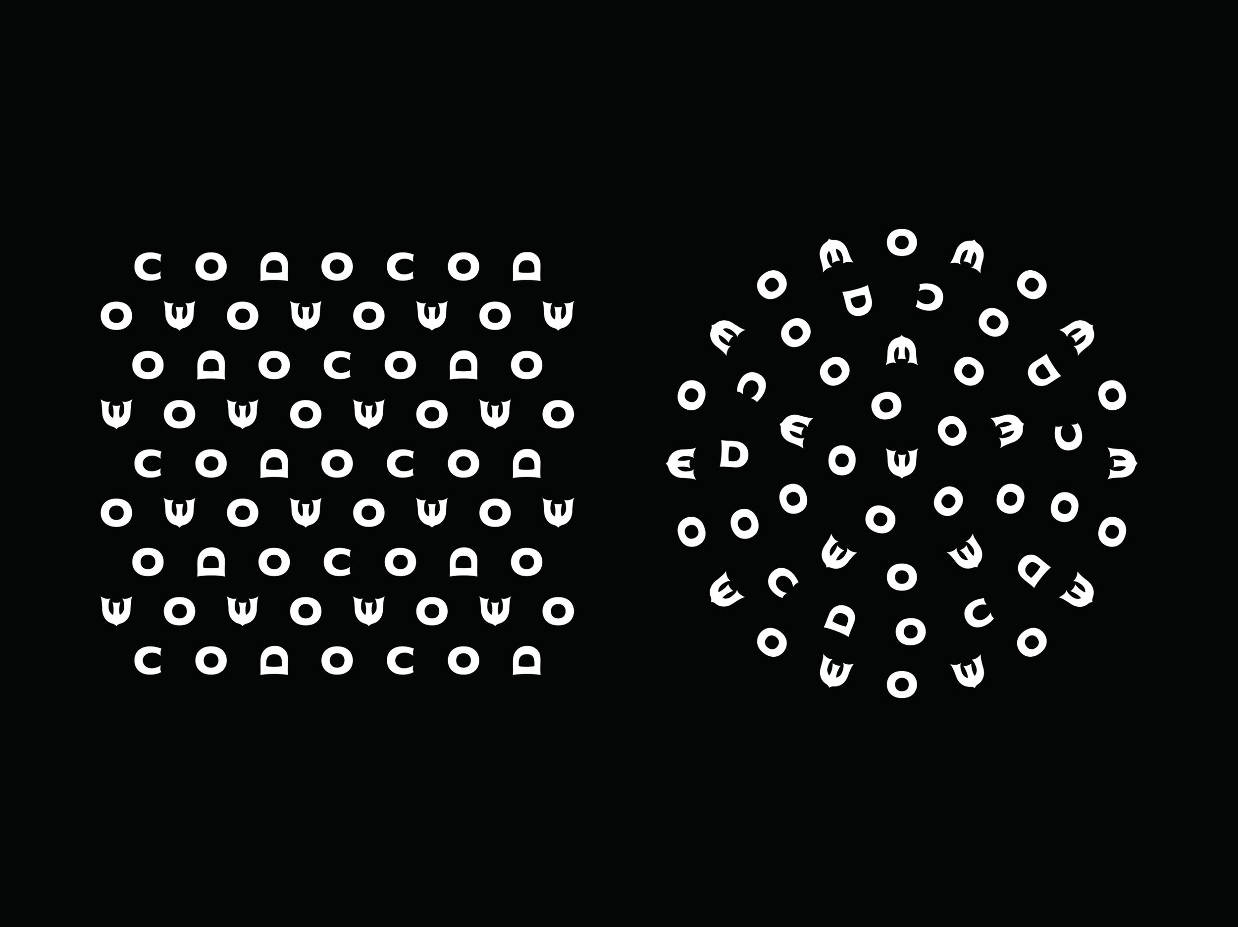
The logotype is versatile as it can be arranged and developed into various pattern designs. The design concept is “overflowing Japanese colors”; it conveys COEDO products’ colors and taste characteristics. The names and labels of the 6 classic beers are based on traditional Japanese colors: kyara, ruri, shiro, shikkoku, beniaka, and marihana. The design of the bottle focuses on details like applying embossed logotype onto the bottle neck to create depth and personality.
Digital Communication services, including website design, search engine optimization, social media, and content creation for nonprofit organizations, consultants, and creative entrepreneurs.


